Before creating my final product I constructed the cover for my own college magazine. This prepared me for my final product as I had to design and create a name, tagline, a colour scheme all with my genre and target audience in mind. I also had to take images and keep to my However for my preliminary task I only created a front cover, then I made flatplans for my double page spread and contents page; this was to show my understanding of creating a college magazine's double page spread and contents page layout.
Since my preliminary task I think my level of technology use has improved, I now understand how to use programs such as Photoshop and Indesign to a more advanced standard. My understanding of Magazine importance in the media industry has developed quite alot, I now realise the appeal an audience finds in a magazine.
Before starting my final product, I just knew the basics of using an Apple Mac, PhotoShop, InDesign and Blogger. I had never used the internet applications Prezi and Slideshare before, however I now know how to use them and also embed my Slideshows and Prezi's to my Blogger. My preliminary task introduced me to programs on the Apple Mac computer, however when it came to my music magazine I feel I used alot more tools provided by programs such as InDesign more efficiently. One of my most used tools was the 'Dropper tool' it allowed me to replicate colours and use them throughout my magazine; I found this useful especially when I was blending in objects or I needed to cut out something from the background and replicate the colour to fill in the gap.
I also think my photography skills have improved, I'm not a great photographer especially when it comes to photographing people and objects however I feel I have improved since my preliminary task. I also feel asthough I understand the angles and shots used on different genres on magazine, what these shots and angles can sometimes suggest about a magazine and how the different shot types can affect the way a photo is seen.
Before starting my final product I wasn't aware of how significant the layout of a magazine could be when it comes to selling and distribution. The right layout, colours and font all affect the genre and target audience and how well the magazine sells. All these aspects help to create the exact magazine the correct target audience is looking for.
Wednesday, 4 April 2012
Monday, 26 March 2012
Saturday, 24 March 2012
Q4&5: Who would be the target audience for your media product? And how would you attract them?
A ‘typical’ target audience member of my magazine:
I created a list of things that could be included in my magazine and asked my target audience which are their priorities of reading when they buy other magazines such as Top Of The Pops, Shout and Sugar. 11/20 said their favourite part of a magazine is the ‘Cringe’ parts where the readers send in their most embarrassing moments. 16/20 said the prices of teenage magazines are too expensive and they can’t always afford to buy them. Also 19/20 of the participants said they like magazines with bright bold colours and fonts.
This was my way of finding out their favourite parts, and the aspects of a magazine that appeal to them the most. Therefore if my magazine were to be created and distributed it would contain the things they want to read and find interesting.
In attempt to make my magazine as appealing to my target audience i felt their opinion was important and asked for it on many occasions throughout creating and designing the pages of my magazine. This was as I am slightly older than my target audience and I’m not entirely sure what they want in a magazine.
Finally I also found that many magazines aimed at 11-15 year olds are quite expensive for their target audience which decreases the consumers as many people wouldn’t be able to afford the high costs. They usually cost around £2.99 which I think is quite a high price for a teenager’s magazine. Therefore I plan to make my slightly cheaper around the £1.50 mark.
Wednesday, 21 March 2012
Tuesday, 20 March 2012
Q2: How does your media product represent particular social groups?
My magazine is a pop magazine aimed at teenage girls aged 11-15. Like in many pop magazines the cover model is the latest chart artist. I imagine my target audience being girly girls that like pop music, bright colours and fashion or shopping therefore this is what I included most in my magazine. I have many themes throughout my magazine making it not just a music magazine. I found this in my research that this is what my target audience likes. I also took a questionnaire in which i asked 45 11-15 year old teenage girls that fit my target audience and asked them what their favourite part of a magazine is and here is what they said:

This shows that many teens like a variety of topics in their magazines and this is what I tried to create.
Many teenage magazines use female models and often in a medium shot. I also discovered that the generic conventions of a model are often slim, smiling, nice clothes and good skin. I kept to these generic conventions and reinforced them as my model is slim, nicely dressed and smiling in all the images. His gives off a fun vibe to the audience and this is what pop music is about and what my target audience’s social group is about too.
I found that when I researched there were many age inappropriate articles such as articles about weight issues, plastic surgery I have tried to break these and not include them in my magazine as I feel they are delicate subjects that young teens shouldn’t be introduced to. This is breaking some representations of young adults in my social group. I think some magazines may be responsible for teens and young adults wanting plastic surgery, and being unhappy with the way they look therefore I didn’t Photoshop anything about my model’s figure or face/ skin therefore breaking the generic conventions of an edited model.
Social groups expected from the Pop genre are quite wide in variety. As Pop is short for popular it usually depends on what is mainstream as to what social groups it is expected to aim at.
Pop is most recently known and referred to worldwide for being targeted at teenage girls that like boy and girl artists/bands. Most Pop magazines aim for this audience too, this is why aspects such as Posters are included in the magazines as it is expected that most teenage girls have posters on their wall of their favourite Pop artist.


Saturday, 17 March 2012
Sunday, 11 March 2012
My final front cover

Here is my completed final design of my front cover. I like how I have tried to make it look busy and interesting but organized. I think if I could do it again I would have added more articles especially in the right bottom corner, as I feel it looks slightly empty however I didn't want it to look unbalenced. I have tried to keep to a co-ordinating palatte of colours to keep it all matching. I have used real magazine covers for inspiration and I have tried to include what my readers and target audience would want. I decided I wanted to make the first edition quite cheap and the next installment would be around the £1.50 mark. As my readers are only young teens that more than likely don't work, they won't have much money to spend, therefore meaning my magazine has an extra appeal as it is in their age range and not too expensive.
Wednesday, 7 March 2012
Changes to my final front cover

After adding more articles and things to look at I plan on adding a puff, barcode, price and one more article to keep it interesting so the magazine is eye catching and there is lots to look at.

I have added more things to look at, however before I post my final cover I plan on adding a puff and maybe move a few things around and I feel the left corner article doesn't stand out as much as it could.
Wednesday, 29 February 2012
My Cover Photos


For my cover I narrowed my decisions down to 4 different images which all had their pros and cons of using.
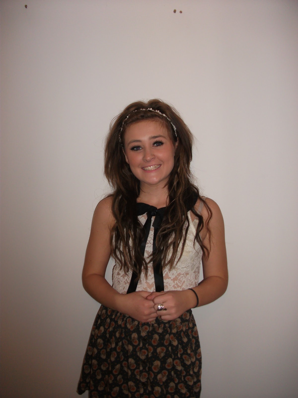
They're all medium shots and all head on angles. I like the lighting on the first photo; the shaded corners in every corner, however I would need to crop the top quarter off, this will ruin the natural lighting. I like how close my third image is however my model is standing to the left therefore this will ruin my layout as I intended to have my logo to the right of the page. In the 2nd image I think the camera is quite far away from her face, which spoils the eye contact with the audience. I like the 4th image as I feel I could fit it on my cover well and keep the layout. The image is well lit and she's looking directly at the camera, and because of this I have decided to use this image as my cover.
I have decided to use the 1st image in my contents page as I feel it will fit nicely on the page.
Saturday, 25 February 2012
Cover flatpans

This is what I plan my cover to be layed out like. I will use this guide as to where things will go on my cover.
Monday, 20 February 2012
My Ideas
The inspiration and ideas for my magazine's front cover came from three magazines; one childrens/teenagers magazine, one fashion magazine and a music magazine. As my magazine's main genre isn't just music as I found that in my research, in most Pop magazines they try to mix subjects that appeal to the target audience; music, fashion, celebrities etc. this gains a wider appeal.
Teen mag: Fashion mag: Music mag:


 This magazine talks about music, fashion, TV and celebrities - most/all of these appeal to the majority of teenage girls.
Teen mag: Fashion mag: Music mag:


Friday, 17 February 2012
POP! development
1.
2.
3.
I tried and edited my logo for the cover of my magazine many times, I felt they all fit with my genre, also I think the top one may be slightly young and childish for my target audience. I like the teal coloured font with the pink stroke outlining it. However I like how bold the third one looks, and stands out the page. After taking a questionnaire on my target audience asking them their favourite font and colour.
Here are my results in a pie chart:

Thursday, 16 February 2012
Final Contents

This is my final attempt of my magazine, I slightly adjusted my background to keep it neat, as my plan from the beginning was to make sure it didn't get too busy and overly unorganized.
I am happy with my final contents page I feel that it could have slightly more photos however I had planned to keep it simple.
Monday, 13 February 2012
Changes to my contents

Next I tried adding a puff in the left hand corner to fill the gap, and I also added a tagline at the bottom of the page to make the magazine slightly more interesting.

Next I tried adding more colour, but staying with my co-odinated palette to see what it would look like as I felt it looked too plain for a teen magazine. Therefore I put a blue and pink background, to add to the brightness and boldness of my magazine.
Thursday, 9 February 2012

This is my first attempt at my magazine contents page, I plan to make it brighter and colourful. However I like how the bright blue and pink looks against the white. I think the 'Inside this month' article needs to be in bolder font to make it stand out from a distance. I also need to fill in the gap in the bottom left hand corner, I plan on putting a puff here of some sort. But I like how my editors note looks asthough its been hand written.
Saturday, 4 February 2012
Contents page - Flatplans

These are the flaplans for my contents page, I want my magazine to be busy and filled with photos and text for the audience to look at and read. I discovered in my research this is often what happens in many pop magazines and teen magazines. Also with bright contrasting/ clashing colours; such as yellow and blue or orange and green. This keeps it bold and vibrant.
My inspiration for my contents page is this page from 'We Love Pop' magazine:

Its busy, bright and bold just like how I want mine to look. I think I would like mine to look slightly more organized unlike this page as I find it hard to read as I am unsure where to look; however I am not the target audience therefore I chose to let my target audience decide if they'd prefer the magazine to be organized or slightly more jumbled like this one.
I showed 25 year eight students (12-13years) my magazine flat plan and the completed 'We Love Pop' magazine contents pages to see which one they'd prefer and here is the outcome in a pie chart:

2= My layout
More people said they found reading We Love Pop magazine was hard as the layout wasn't orgnanised. This is why I am going to try to make mine slightly more readable for the consumers.
Wednesday, 1 February 2012
Final Double Page Spread

This is my final finished version of my magazine's double page spread. I have tried to come up wit a similar design to my inspiration (below) using my research to develop and build my magazine. However still keeping my target audience and own ideas in mind.


Thursday, 26 January 2012
Development and growth of my double page spread
While designing my Front cover, double page spread and contents I am using 'We Love Pop' magazine as inspiration and for ideas. After researching their magazine, I used some of their ideas, however changing them slightly to create my magazine with my style and target audience in mind. I did this to attempt to make the magazine as a whole look more professional and advanced.

This is how I started my double page spread, it began simple as I was experimenting with colours and my layout. I tried using the colour dropper to replicated the colour of the balloons for the background of my text, and the font the colour of the other balloons. This created a co-ordinating pallette of colours which all worked together, which is almost always used in magazines. I didn't like the idea of having a white background so I plan to choose a colour or find a pattern of some sort.


This is how I started my double page spread, it began simple as I was experimenting with colours and my layout. I tried using the colour dropper to replicated the colour of the balloons for the background of my text, and the font the colour of the other balloons. This created a co-ordinating pallette of colours which all worked together, which is almost always used in magazines. I didn't like the idea of having a white background so I plan to choose a colour or find a pattern of some sort.
After deciding on colours I chose a font, that was fun, informal but still readable. I tried to keep it quite simple but with contrasting colours to make it jump out. I focused the colours and font I used on my target audience. By using simple, girly colours sky blue and baby pink this tied in with the genre of the magazine too. One change I would have made would have deciding on a colour theme before taking my photos- then I could have co-ordinated my colours with the clothing or make up on my model. However I like that I made my backgound of the text the same colour as the background of my model.

This is my third attempt of my double page spread with my text and headlines complete. I have kept the colours quite simple- only using 2 colours in my text and a beige background colour which matches the background behind my model. I wish to pay a attention to detail in my final attempt such as spacing out the text slightly and making the title 'Lea! Welcome to my world!!' slightly bigger so it stands out more.
I have tried to focus around a few articles from other magazine by using their double page spreads for inspiration and ideas for my design and layout. After research I found very few articles in teenagers magazines continue over a double page spread. They often keep text to a minimal to keep it short and snappy.
Before I complete my magazine I plan to put 'Lea' in bigger font and put 'I'll always be the girl that worked in Tesco' quote in the same font as the rest of the magazine spread.
Sunday, 22 January 2012
Editing my photos-
Here is one of my photos for my double page spread-
It began as a wide shot with other objects in the photo.

Using PhotoShop I have now cut out the main parts of the other objects in the photo.

 The next step that I did was cut out the photo slightly more carefully, ensuring all the other bits are completely gone. Finally I used the Eyedropper tool to blend the background all together.
Friday, 20 January 2012
My Flatplans - Double Page

This is my flatplan for my double page spread. This shows how I am aiming to layout my double page, I will follow this when placing text and my images.
Thursday, 19 January 2012
ADD SECOND DECON.

ADD SECOND DECONSTRUCTION
I am using 'We Love Pop' magazine as inspiration and for ideas. After researching their magazine, and using some of the ideas and changing them slightly to create my magazine. Also to make it look more professional and advanced.


Tuesday, 17 January 2012
Including technology
To keep it recent and up to date I am including current technologies. I have decided to include Twitter and Facebook accounts for the magazine and my new artist. This allows readers to keep up to date on the magazine and artist I am advertising. This is also free for users and the company.


Friday, 13 January 2012
Music Magazine: My Photos
I took lots of photos from different angles, after doing my research I tried replicating the sort of angles and poses they used in the magazines similar to mine.

 As my magazine is a Pop magazine I tried to use smiley, medium/close up shots. And a variety of low and normal angled


 As my magazine is a Pop magazine I tried to use smiley, medium/close up shots. And a variety of low and normal angled
 shots. These are all the photos, and my favourites which will be used in my magazine.


I took lots of medium/close up shots for the cover of my magazine, as i found these shots are used most.
In most of the photos i tried to use a white background, I think this makes them look morre realistic and profession. I am really pleased how most of the photos turned out, however I think if I had a SLR camera some of the photos would have been easier to take.
Subscribe to:
Posts (Atom)