Before creating my final product I constructed the cover for my own college magazine. This prepared me for my final product as I had to design and create a name, tagline, a colour scheme all with my genre and target audience in mind. I also had to take images and keep to my However for my preliminary task I only created a front cover, then I made flatplans for my double page spread and contents page; this was to show my understanding of creating a college magazine's double page spread and contents page layout.
Since my preliminary task I think my level of technology use has improved, I now understand how to use programs such as Photoshop and Indesign to a more advanced standard. My understanding of Magazine importance in the media industry has developed quite alot, I now realise the appeal an audience finds in a magazine.
Before starting my final product, I just knew the basics of using an Apple Mac, PhotoShop, InDesign and Blogger. I had never used the internet applications Prezi and Slideshare before, however I now know how to use them and also embed my Slideshows and Prezi's to my Blogger. My preliminary task introduced me to programs on the Apple Mac computer, however when it came to my music magazine I feel I used alot more tools provided by programs such as InDesign more efficiently. One of my most used tools was the 'Dropper tool' it allowed me to replicate colours and use them throughout my magazine; I found this useful especially when I was blending in objects or I needed to cut out something from the background and replicate the colour to fill in the gap.
I also think my photography skills have improved, I'm not a great photographer especially when it comes to photographing people and objects however I feel I have improved since my preliminary task. I also feel asthough I understand the angles and shots used on different genres on magazine, what these shots and angles can sometimes suggest about a magazine and how the different shot types can affect the way a photo is seen.
Before starting my final product I wasn't aware of how significant the layout of a magazine could be when it comes to selling and distribution. The right layout, colours and font all affect the genre and target audience and how well the magazine sells. All these aspects help to create the exact magazine the correct target audience is looking for.
Wednesday, 4 April 2012
Monday, 26 March 2012
Saturday, 24 March 2012
Q4&5: Who would be the target audience for your media product? And how would you attract them?
A ‘typical’ target audience member of my magazine:
I created a list of things that could be included in my magazine and asked my target audience which are their priorities of reading when they buy other magazines such as Top Of The Pops, Shout and Sugar. 11/20 said their favourite part of a magazine is the ‘Cringe’ parts where the readers send in their most embarrassing moments. 16/20 said the prices of teenage magazines are too expensive and they can’t always afford to buy them. Also 19/20 of the participants said they like magazines with bright bold colours and fonts.
This was my way of finding out their favourite parts, and the aspects of a magazine that appeal to them the most. Therefore if my magazine were to be created and distributed it would contain the things they want to read and find interesting.
In attempt to make my magazine as appealing to my target audience i felt their opinion was important and asked for it on many occasions throughout creating and designing the pages of my magazine. This was as I am slightly older than my target audience and I’m not entirely sure what they want in a magazine.
Finally I also found that many magazines aimed at 11-15 year olds are quite expensive for their target audience which decreases the consumers as many people wouldn’t be able to afford the high costs. They usually cost around £2.99 which I think is quite a high price for a teenager’s magazine. Therefore I plan to make my slightly cheaper around the £1.50 mark.
Wednesday, 21 March 2012
Tuesday, 20 March 2012
Q2: How does your media product represent particular social groups?
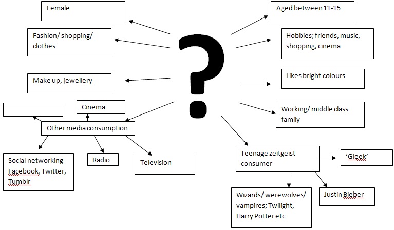
My magazine is a pop magazine aimed at teenage girls aged 11-15. Like in many pop magazines the cover model is the latest chart artist. I imagine my target audience being girly girls that like pop music, bright colours and fashion or shopping therefore this is what I included most in my magazine. I have many themes throughout my magazine making it not just a music magazine. I found this in my research that this is what my target audience likes. I also took a questionnaire in which i asked 45 11-15 year old teenage girls that fit my target audience and asked them what their favourite part of a magazine is and here is what they said:

This shows that many teens like a variety of topics in their magazines and this is what I tried to create.
Many teenage magazines use female models and often in a medium shot. I also discovered that the generic conventions of a model are often slim, smiling, nice clothes and good skin. I kept to these generic conventions and reinforced them as my model is slim, nicely dressed and smiling in all the images. His gives off a fun vibe to the audience and this is what pop music is about and what my target audience’s social group is about too.
I found that when I researched there were many age inappropriate articles such as articles about weight issues, plastic surgery I have tried to break these and not include them in my magazine as I feel they are delicate subjects that young teens shouldn’t be introduced to. This is breaking some representations of young adults in my social group. I think some magazines may be responsible for teens and young adults wanting plastic surgery, and being unhappy with the way they look therefore I didn’t Photoshop anything about my model’s figure or face/ skin therefore breaking the generic conventions of an edited model.
Social groups expected from the Pop genre are quite wide in variety. As Pop is short for popular it usually depends on what is mainstream as to what social groups it is expected to aim at.
Pop is most recently known and referred to worldwide for being targeted at teenage girls that like boy and girl artists/bands. Most Pop magazines aim for this audience too, this is why aspects such as Posters are included in the magazines as it is expected that most teenage girls have posters on their wall of their favourite Pop artist.


Saturday, 17 March 2012
Sunday, 11 March 2012
My final front cover

Here is my completed final design of my front cover. I like how I have tried to make it look busy and interesting but organized. I think if I could do it again I would have added more articles especially in the right bottom corner, as I feel it looks slightly empty however I didn't want it to look unbalenced. I have tried to keep to a co-ordinating palatte of colours to keep it all matching. I have used real magazine covers for inspiration and I have tried to include what my readers and target audience would want. I decided I wanted to make the first edition quite cheap and the next installment would be around the £1.50 mark. As my readers are only young teens that more than likely don't work, they won't have much money to spend, therefore meaning my magazine has an extra appeal as it is in their age range and not too expensive.
Subscribe to:
Posts (Atom)