Thursday 26 January 2012

Development and growth of my double page spread

While designing my Front cover, double page spread and contents I am using 'We Love Pop' magazine as inspiration and for ideas. After researching their magazine, I used some of their ideas, however changing them slightly to create my magazine with my style and target audience in mind. I did this to attempt to make the magazine as a whole look more professional and advanced. 


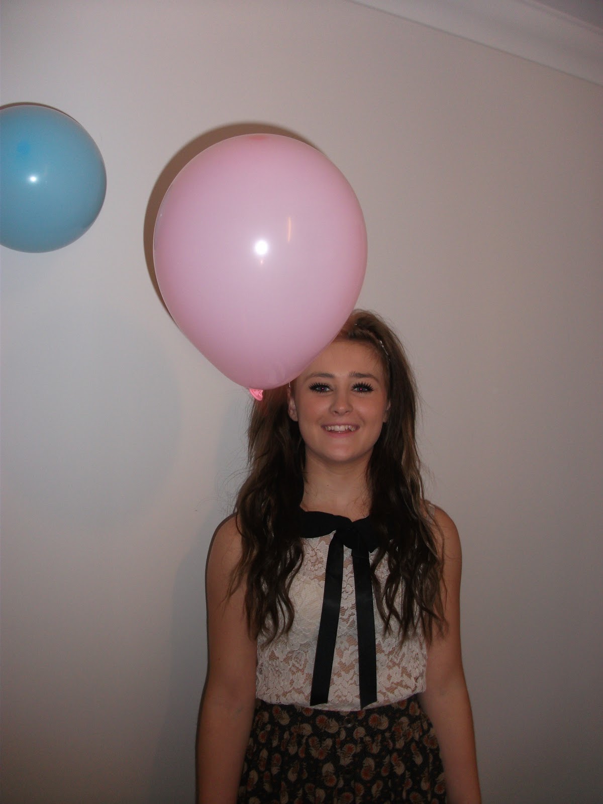
This is how I started my double page spread, it began simple as I was experimenting with colours and my layout. I tried using the colour dropper to replicated the colour of the balloons for the background of my text, and the font the colour of the other balloons. This created a co-ordinating pallette of colours which all worked together, which is almost always used in magazines. I didn't like the idea of having a white background so I plan to choose a colour or find a pattern of some sort.


After deciding on colours I chose a font, that was fun, informal but still readable. I tried to keep it quite simple but with contrasting colours to make it jump out. I focused the colours and font I used on my target audience. By using simple, girly colours sky blue and baby pink this tied in with the genre of the magazine too. One change I would have made would have deciding on a colour theme before taking my photos- then I could have co-ordinated my colours with the clothing or make up on my model. However I like that I made my backgound of the text the same colour as the background of my model.


This is my third attempt of my double page spread with my text and headlines complete. I have kept the colours quite simple- only using 2 colours in my text and a beige background colour which matches the background behind my model. I wish to pay a attention to detail in my final attempt such as spacing out the text slightly and making the title 'Lea! Welcome to my world!!' slightly bigger so it stands out more.

I have tried to focus around a few articles from other magazine by using their double page spreads for inspiration and ideas for my design and layout. After research I found very few articles in teenagers magazines continue over a double page spread. They often keep text to a minimal to keep it short and snappy.

Before I complete my magazine I plan to put 'Lea' in bigger font and put 'I'll always be the girl that worked in Tesco' quote in the same font as the rest of the magazine spread.

Sunday 22 January 2012

Editing my photos-

Here is one of my photos for my double page spread-

It began as a wide shot with other objects in the photo.


Using PhotoShop I have now cut out the main parts of the other objects in the photo.


The next step that I did was cut out the photo slightly more carefully, ensuring all the other bits are completely gone. Finally I used the Eyedropper tool to blend the background all together.

Friday 20 January 2012

My Flatplans - Double Page


This is my flatplan for my double page spread. This shows how I am aiming to layout my double page, I will follow this when placing text and my images.

Thursday 19 January 2012

ADD SECOND DECON.


ADD SECOND DECONSTRUCTION


I am using 'We Love Pop' magazine as inspiration and for ideas. After researching their magazine, and using some of the ideas and changing them slightly to create my magazine. Also to make it look more professional and advanced. 


Tuesday 17 January 2012

Including technology

To keep it recent and up to date I am including current technologies. I have decided to include Twitter and Facebook accounts for the magazine and my new artist. This allows readers to keep up to date on the magazine and artist I am advertising. This is also free for users and the company. 


Friday 13 January 2012

Music Magazine: My Photos

I took lots of photos from different angles, after doing my research I tried replicating the sort of angles and poses they used in the magazines similar to mine.

As my magazine is a Pop magazine I tried to use smiley, medium/close up shots. And a variety of low and normal angled
shots. These are all the photos, and my favourites which will be used in my magazine.


I took lots of medium/close up shots for the cover of my magazine, as i found these shots are used most.

In most of the photos i tried to use a white background, I think this makes them look morre realistic and profession. I am really pleased how most of the photos turned out, however I think if I had a SLR camera some of the photos would have been easier to take.


I also tried close ups to be used inside my magazine, whether it was on the contents page, or double page spread. Once again I kept to the white plain background. I am most likely going to use one of these photos on my contents page.


I also tried wide shots to use in my double page spread. I used balloons in the photo because my headline is going to be "I'm X-Factor Winner 2011, never in a million years have I ever even dreamt of saying that!" Saying she's won X-Factor so she's celebrating! It was hard to keep the balloons up in the air, to take the photo and to get Erin to look at the camera all at the same time. However some of the photos I will use to have a variety of shots in my magazine.