Thursday, 19 January 2012

ADD SECOND DECON.


ADD SECOND DECONSTRUCTION


I am using 'We Love Pop' magazine as inspiration and for ideas. After researching their magazine, and using some of the ideas and changing them slightly to create my magazine. Also to make it look more professional and advanced. 


Tuesday, 17 January 2012

Including technology

To keep it recent and up to date I am including current technologies. I have decided to include Twitter and Facebook accounts for the magazine and my new artist. This allows readers to keep up to date on the magazine and artist I am advertising. This is also free for users and the company. 


Friday, 13 January 2012

Music Magazine: My Photos

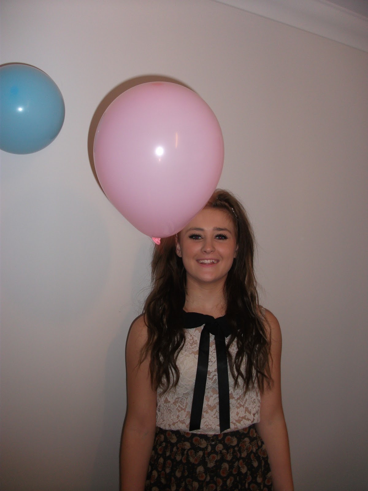
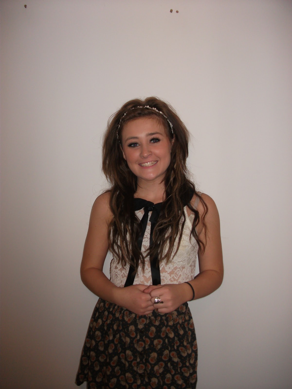
I took lots of photos from different angles, after doing my research I tried replicating the sort of angles and poses they used in the magazines similar to mine.

As my magazine is a Pop magazine I tried to use smiley, medium/close up shots. And a variety of low and normal angled
shots. These are all the photos, and my favourites which will be used in my magazine.


I took lots of medium/close up shots for the cover of my magazine, as i found these shots are used most.

In most of the photos i tried to use a white background, I think this makes them look morre realistic and profession. I am really pleased how most of the photos turned out, however I think if I had a SLR camera some of the photos would have been easier to take.


I also tried close ups to be used inside my magazine, whether it was on the contents page, or double page spread. Once again I kept to the white plain background. I am most likely going to use one of these photos on my contents page.


I also tried wide shots to use in my double page spread. I used balloons in the photo because my headline is going to be "I'm X-Factor Winner 2011, never in a million years have I ever even dreamt of saying that!" Saying she's won X-Factor so she's celebrating! It was hard to keep the balloons up in the air, to take the photo and to get Erin to look at the camera all at the same time. However some of the photos I will use to have a variety of shots in my magazine.

Saturday, 7 January 2012

Double page practice, edited.


Now i have tried adding an image surrounded by text and into my magazine, also a page number in the bottom left corner. I didn't know who to wrap the text round the image before this lesson without rearranging all the text. It makes the whole thing along easier rather than starting a new text box to fit around the image. This is good practice for when it comes to creating my actual magazine double page spread. It is a lot easier the the InDesign shortcuts, it helps everything fit together and I think I picked up on it quite quickly.

Thursday, 5 January 2012

Practice double page spread

Here is my practice attempt at my double page spread. I've practiced putting in and resizing headlines, columns, images, and tried using a various fonts. I found I picked up on this quite quickly as I read lots of magazines anyway and I have studied the layout of a Pop magazine while doing my research. I tried to keep it to the same sort of layout to  most magazine pages. I like the way that InDesign has many different shortcuts and tricks which makes the magazine pages look more professional. I have learnt alot in todays lesson on the layout of a magazine and  how to produce a similar looking page.